Task Flow
The Cafe owner wants to share his love of trains with fellow train enthusiasts and coffee lovers.
With the UX research in hand, a single task flow was created for users to achieve their goals.
A simple process of user wanting to read about what the Cafe is about and find Sakura Coffee.

Wireframes
Low Fidelity
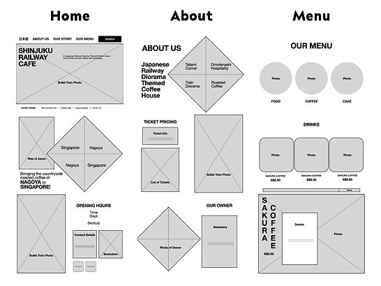
Based on the task flow, there will be 3 pages.
The home page gives user an idea of what the cafe is about in general, including basic info.
The about page tells user the backstory of the cafe and what it has to offer.
The menu page shows user the type of foods and drinks available, to entice them into trying.
Logo
The logo is inspired by the symbolic rising sun of the Japanese national flag. The circle immediately connects with the idea of Japan's cultural identity. Since the Japanese railway cafe is the first of its kind to open in Singapore, the rising sun can be interpreted as a new beginning and energy.
The white colour is associated with new beginnings or a fresh start, and is also associated with perfection, honesty and cleanliness. The three words that best represents the cafe which can also refer to its Omotenashi or Japanese hospitality in serving the customers.
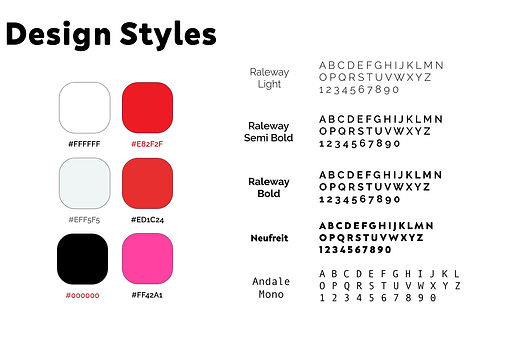
Design Styles
The colours are up to my discretion. I chose the basic colours of white and red which reflects the national colours of both Japan and Singapore. With some shades of cherry blossoms, the iconic symbol of Japan.
The bold font of Neufreit is chosen for the logo as it has a bit of a calligraphic feel to it while ensuring readability. The Raleway font is used for texts for its versatile and readable sans serif design. The Andale Mono is used as prompts, which reminds users of the train schedules they usually see at train stations.
Prototype
High Fidelity
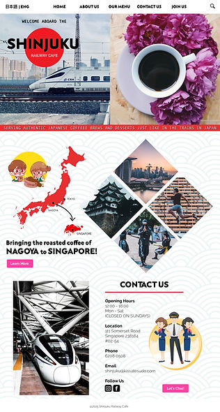
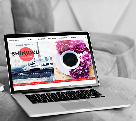
Since it's a Japanese Railway Themed Cafe, I use a photo of the iconic bullet train aka Shinkansen. I choose a theme colour of red and white, because they represents the national colours of Japan and Singapore.
I add a traditional Japanese pattern, wagara, on the background to give it a unique Japanese aesthetics. Here I want to emphasis the connection between Japan and Singapore, depicted by the illustration and photos.
I do not want to overwhelm the visitors with too much information on the landing page. I choose photos which best represents Nagoya and Singapore, from its iconic buildings to its people.
As most websites, the bottom page is the contact details, opening hours and social media links. I use the illustration of train conductors to symbolise the customer service.
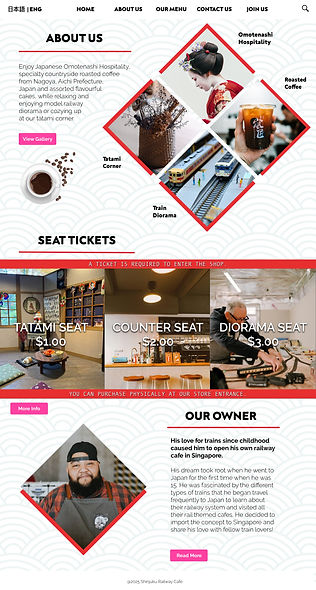
Here, the 4 main aspects of the cafe which makes it unique as compared to other cafes are shown. The specialty roasted coffee, the train diorama, the tatami corner and the Japanese hospitality.
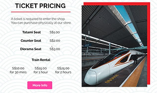
I got the inspiration for diamond type of design from the Samurai emblem of Feudal Japan. Here is the overall pricing of tickets needed to enter the cafe to give an authentic train station experience.
This is the brief story of the cafe owner and how he came about opening the unique cafe in Singapore. His backstory will be useful for customers to interact with him at the cafe to know more about his story.
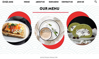
There are 3 categories, food, drinks and cakes.
Food being toast and bread, as the cafe does not serve main dish food such as ramen or bento rice.
Drinks, being cold and hot drinks, including coffees and fruit juices. While cakes are more of pastries.

Iterations
There are several iterations but here are the two key changes made based on user feedbacks.
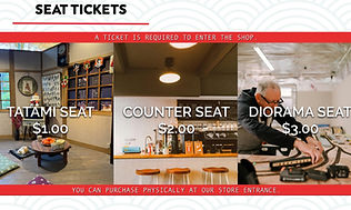
1. Photos of each seat shown on ticket pricing section
At the high fidelity stage, user remarked that she wants to know what the different seats and pricing looks like.
Photos of the seats are added for the ticket pricing section so the users know what to expect for each type of seats.
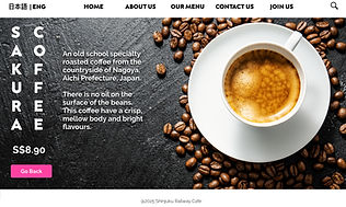
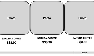
2. All drinks are shown in one page instead of scrolling
At the early stage of low fidelity, a user mentioned about the troublesome experience in finding Sakura Coffee.
So the coffee menu is changed from scrolling horizontally to putting everything one page for convenience.


Priscilla, Cafe Lover
It'd be nice to know what the seats look like?
I think it's troublesome to scroll one by one to find your drink?
Jasper, Train Enthusiast
Final Design
Self-Reflection
If I were to commit into designing the entire website, I would:
-
talk to the cafe owner to know about his ideal website, the things he wants to show and the design he is looking for, the brand identity he wants to present to customers
-
conduct user research and interviews of customers, to know their thoughts on what they look for in a website, in terms of content and visual design
-
search for more variety of illustrations and icons to be used for different pages
-
take high quality photos of the cafe to give customers an idea of the atmosphere