User Research
User research was conducted to understand user behaviour and current trends in language learning apps, with the goal of identifying opportunities to improve the learning experience.
Research Focus
The research aimed to explore:
-
Users’ perceptions of language learning apps
-
Features they like and dislike in existing apps
-
Their definition of an “ideal” learning experience
-
Opportunities to create a more efficient and engaging learning flow
Target Audience
-
Active Working Adults (25-54 years old)
-
Male and female users
-
Working professionals and students who are actively learning new languages

Affinity Mapping & Persona
From user interviews, responses were grouped into three key themes: pros, cons, and ideas, with “ideas” being the most significant category.
Pros
-
Flexible learning without fixed class schedules
-
Works well as a supplement to offline learning
Cons
-
Many apps require payment, raising concerns about value for money
-
Some apps are difficult to navigate and not intuitive to use
Ideas
-
More comprehensive functionality (word search, translation, explanations)
-
Real-life conversation scenarios and examples
-
Ability to choose learning level, topics, and tests
-
Chat-based practice for conversational skills
-
A more complete learning experience beyond flashcards and word tapping


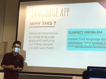
Apps have to go through paywall while google translate is free.
Justin
Nikita
Some apps are hard to use.
Would be helpful if can search words, as google translate is not 100% accurate.
Harris
User Motivations
-
Pricing and value for money
-
Functionality and usefulness
-
Flexibility in learning pace and schedule
Problem Statement
Active working adults (25–55 years old) need a more flexible and meaningful way to learn languages, as existing apps often have limited functionality and do not fully support their learning needs.
Hypothesis
We believe that by designing a language learning app with more flexible features and learning options for active working adults (25–55 years old), users will experience a more engaging, interactive, and effective learning process.
Persona
The primary user is a busy working adult who wants to learn a new language on the go, often during commuting or short breaks. They need a flexible, efficient, and practical learning tool that fits into their daily routine.

Competitive Analysis
Conducted to evaluate five existing language learning apps and identify gaps in the current market.
Comparison Matrix
Competitors were assessed based on three key user motivations:
-
Price
-
Functionality
-
Flexibility
The analysis revealed that while existing apps perform well in one or two areas, none successfully balance all three factors together.
This highlights a clear opportunity gap in the market.

Competitive Map
The competitive positioning map further illustrates this gap, showing a lack of solutions that combine affordability, strong functionality, and flexible learning options.
There is an opportunity to design a language learning app that bridges this gap by offering a more balanced experience — combining affordability, useful features, and learning flexibility to better support user needs.

Prototyping & User Flow
Minimum Viable Product
Due to time constraints in the short course, I focused on one core feature of the app: word search functionality.
While the ideal product includes multiple learning features, the MVP was designed to validate whether users could efficiently search and understand words within a single streamlined flow.

User Flow
The main task scenario involved a user searching for the Japanese word “Chotto” after encountering it in a subtitled Japanese drama.
This flow was designed to simulate a real-life learning moment and test how quickly users could retrieve meaning and context within the app.

Low Fidelity Wireframes
Initial wireframes were created to explore basic structure and layout.
At this stage, the focus was on simplicity and establishing a clear navigation flow rather than visual design.
Early usability testing was conducted to gather feedback and identify major usability issues.

Mid Fidelity Prototype
Based on feedback, the design was refined to improve clarity and usability.
This stage focused on ensuring users could understand the flow and complete the search task without confusion.
Additional usability testing was conducted to validate improvements and refine interactions.

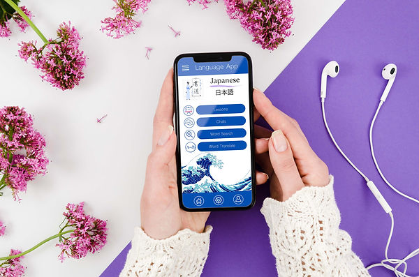
High Fidelity Design
The final stage focused on visual design and user experience refinement.
A calm blue colour palette was chosen to create a soothing and focused learning environment. Subtle Japanese-inspired visual elements were included to reflect the language context while maintaining simplicity and readability.
The goal was to create a clean, modern interface that supports learning without distraction.

Usability Testing & Iterations
Iterations
Based on feedback from usability testing, several refinements were made from low-fidelity to high-fidelity designs to improve clarity, usability, and task efficiency.
These changes focused on simplifying the user flow and making the word search feature more intuitive and accessible.

Usability Testing Results
Testing showed that users were able to:
-
Successfully search for words without confusion
-
Understand both text and audio-based search functions
-
Navigate the interface with ease
-
Complete tasks with minimal explanation needed
Overall, users found the interface intuitive and easy to understand at first glance.

Final Design
The final prototype delivers a clean and intuitive word search experience that allows users to quickly find translations and meanings through both text and audio input.
Usability testing showed that users were able to complete tasks easily and found the interface clear, simple, and visually appealing.
Overall, the design successfully balances functionality with a calm, accessible learning experience.
Lessons Learned
This project reinforced the importance of designing with the user, not personal preference, in mind.
Key learnings include:
-
Design decisions must be guided by user needs and behaviours
-
Simplicity improves usability and reduces cognitive load
-
A successful product balances functionality with visual clarity
-
A structured, iterative process leads to stronger outcomes
Future Improvements
If given more time, I would expand the app to include:
Additional features
-
Word, phrase, and sentence translation tools
-
Chat and voice interaction with learners and native speakers
-
Video-based learning scenarios and conversations
-
Quizzes, tests, and structured learning paths
Visual and UX improvements
-
More tailored illustrations and icon sets for different languages
-
Further refinement of UI consistency across screens
-
Additional user testing and feedback cycles
-
Stronger focus on visual hierarchy and interaction design
